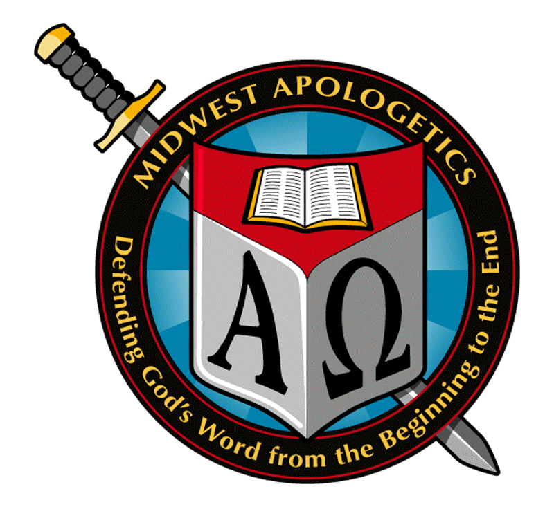
About the Logo
by Tim Chaffey
I wanted the logo to symbolize what Midwest Apologetics is all about. I got the idea from a university seal I saw a few months ago. I knew I did not have the artistic ability to pull it off so I did some brainstorming with a few of my students and came up with the basic design you can see in the background of this page. Fortunately, I was given the name of a graphic designer in a friend's church who was willing to design it for me. It turned out better than I could have imagined.
2 Corinthians 1: 22 tells us that "God has sealed us and given us the Spirit in our hearts as a guarantee." The seal design represents this guarantee of salvation given by God to the believer. The ultimate goal of any apologist is to see people come to Christ. As such, salvation needs to a major emphasis of our efforts.
The sword is probably a little more obvious. Ephesians 6: 17 reveals that God's Word is the "sword of the Spirit." Hebrews 4: 12 states, "For the word of God is living and powerful, and sharper than any two-edged sword, piercing even to the division of soul and spirit, and of joints and marrow, and is a discerner of the thoughts and intents of the heart."
A shield is the focal point of the logo. Obviously, a shield is used for defense. Ephesians 6: 16 immediately comes to mind: "above all, taking the shield of faith with which you will be able to quench all the fiery darts of the wicked one." However, the main reason I chose the shield comes from every apologists' life verse. 1 Peter 3: 15 states "But sanctify the Lord God in your hearts, and always be ready to give a defense [Gr. apologia] to everyone who asks you a reason for the hope that is in you, with meekness and fear." God has called us to defend the faith and the shield is a perfect symbol for that.
The open Bible in the top-third of the shield represents that which we are called to defend, namely, God's Word. So the Bible is represented in two places on this logo. The reason for that is that we are supposed to defend it (hence, its location on the shield) but we are also supposed to use it as a weapon (hence, the sword).
The symbol on the left-third of the shield looks like a capital A. However, it is the first letter of the Greek alphabet (alpha). It represents the beginning of something. In this case, it is the beginning of God's Word, which, sadly, is an area often neglected by apologetics ministries. We place a heavy emphasis on the first eleven chapters of Genesis because they are foundational to the entire Bible. Stretching the symbolism a bit, we find that Jesus claimed to be "the Alpha and the Omega" (Rev. 1: 8, 11; cf. Rev. 21: 6 and 22: 13).
Speaking of "Omega," the horseshoe-looking object in the right-third of the shield is the last letter of the Greek alphabet (omega). God's Word ends in the Book of Revelation. This book is filled with prophecies concerning the last days. Not only do we believe we are living in these last days but prophecy is one of the apologists' greatest tools. No other holy book dares to include prophecy yet more than 25% of the Bible is prophetic. This is one of the ways in which God sets Himself apart from all of the false gods (Isaiah 44: 10). The omega symbol represents the end of the Bible. Used in connection with the alpha symbol it sets the content of what we are to defend - the entire Bible.
So the shield is actually a visual representation of the words encircling the bottom half of the seal: "Defending (shield) God's Word (Bible) from the Beginning (alpha) to the End (omega). Some may try to find meaning in the colors. I have not done that but if you know of something represented by the colors let me know. I am so thankful that God brought one of His wonderful servants into our lives at just the right time to design this for us.